Friday 4 April 2014

Conventions of campaigns

There are many conventions of campaigns as it helps promote the product and it catches the audiences eye.  

Types of conventions: 
  • Slogan 
  • Logo
  • Same character throughout 
  • House colours 
  • Effective language such as persuasive language 
  • Campaign/brand name 
  • Website 
  • Social networking such twitter etc 
  • Contact details 
  • Way of promoting their product/campaign eg posters, leaflets. 

Target audience profile

Our target audience for our campaign is the younger generation 7-14, classes A-D. We want to target them because we feel like they will want to get involved more as it would benefit them the most present and future. We will target them by using colours that will catch their eye. Throughout our products we will use an old man figure to show that he is upset with the way the church is and want to help him but also want to make sure that the church doesn't end up like that for them in the future. We feel like if they know the church will benefit them in making new friends and having a place to go they will want to be more involved.

Tuesday 1 April 2014

Evaluation

The aim for our campaign was to regenerate the village church in Weston as it was neglected.
The name of our company is Weston. The 2 media products we done was a 2-3 minute documentary about a man who has lived in Weston his whole life and looks back on his life when the church was in use. The other media product i chose was 2 posters and a leaflet. To promote our print based media forms we were going to hang up around the village of Weston. The 2 media forms link as they all have the house colours red and blue. They are also aimed at our target audience and they get the message across that we need the help of the community to bring life back into the church. The 2 media forms also link as we have the same people in the documentary and print based medias to get people to recognize our campaign.
We purposely chose this area as we think if the church would to be in use then the younger generation will be able to have somewhere to go and we thought that it would bring the community together. We researched ways to target our audience, which is the younger generation and we used this throughout our blog.
We followed the brief and collected information such as surveys, interviews and research online to find the best way to see who would get the most involved with our campaign and we chose our target as 11-14 year olds. By choosing this age group we thought that we could also target their parents through them. From research we found out the best way to target our audience is to use film and print based media. In our media products we used ways to get sympathy for the character we used throughout and to use the same colours. We used red and blue as they are suitable for both genders. In our products to show how when something was upsetting or negative the lighting would be dimmer compared to when something was meant to be quiet positive.
In my group Lena Harding and Denver Tuck done all the filming and shooting and i edited the videos and we all worked together to come up with our ideas. With our print productions we all came up with our own ideas and worked independently on our products. As our target audience was the younger generation we stuck to the rules and regulations. We made sure we didn't make any of our products inappropriate.
I think what was succesful in our campaign was working well in a team to come up with different but good ideas and also the way we presented our campaign. I think what we could of done was to set deadlines as we could improve the quality of our print products.

Friday 14 February 2014

Leaflet and Poster


Brainstorm locations for photo shoot/film.


We want to film infront of a church so they know what we want to regenerate. We want to set the scene. We will get pictures of the community to show how we want to help the community. We want to film parts of Weston village to get to people to know it's a countryside so it shows that they need somewhere to go.  

Final name, slogan and logo with reasons and how it relates to brief and target audience.

 We our going to use this logo because it includes the house colours we want to use as in our survey we found that these were the colours that attract our target audience. It also includes our slogan,we want to use this slogan as it's catchy and witty which we think our target audience would like. It helps the audience understand we want to regenerate and help the community. The stars show the childish side of it which is good as our target audience is pre-teens.

Thursday 13 February 2014

Class feedback of presentation

i like that they used a video in their presentation as it showed that they put a lot of effort into their presentation, it was also very clear. They could had more images of the product but overall very good.

They had a very clear presentation with lots of examples of advertisement and the video was a good addition to the presentation. They could've been more loud when addressing the audience and they could've justified their points even further. It was a very resourceful and useful presentation though.

bullet point the main points

Clear neat presentation with a lot of detail 
could make the posters bigger so they were easier to see

really good and detailed and we understood what they were saying;. They had strong opinions towards their ideas and the whole campaign linked together

Good amount of derail but looked at their notes to much

clearly spoken, good mock ups, great ideas

Poster drafts


This poster shows at each corner a type of activity that will take place at church for example as you can see in the poster it shows football, reading and arts and crafts. The slogan is across the middle of the poster. The 'we' in the slogan will be the house colours blue and red. The background will be a blue and red as well as from the results of our survey that was the most liked colour. 

This poster is different as it a picture of the church in the middle, big and clear. Like the first poster the slogan will be across the top with the 'we' in the house colours red and blue. To catch the audiences eye i will have on the poster in clear and big font, a way of trying to persuade the audience e.g 'We need your help. 

 My third poster will show a picture of the church in the middle of the page and either side will show the man from our documentary looking happy when the church was in use. To help it make it look like a happy atmopshere i will add flowers and a sun compared to the other side of the church it will show it n a negative way by having rain, the man looking upset and no flowers etc. 


For my print production i drew 3 poster drafts but ive decidiced to do 2 posters and 1 leaflet as i feel the leaflet will get through to more of the target audience. 

Monday 10 February 2014

Audience Research


http://www.surveymonkey.com/s/GRWM5DJ General Audience 

http://www.surveymonkey.com/s/GTMDRW7 Target Audience 


Our Results:

General Audience Survey: 


Target Audience Survey
 
From the results we have found out that not only is our target audience is interested but also the parents from our target audience. Also from the results we found out that print and TV are the most useful and effective way to catch the audiences attention. The house colours we chose were red and blue and as they seem to be the most relevant/effective towards our target audience. From the survey all the clubs seem to be popular so we will most probably advertise for all clubs. 

Weston Presentation 2

Weston Presentation

Pros and Cons

Wednesday 5 February 2014

Research notes

OUR CAMPAIGN IDEAS: 
as Regeneration asked we aim to focus on regenerating the church in Weston, for the community’s sake. We would like to regenerate the whole church so that youths are able to go there when they have no where to go, and also for religious purposes. We are aiming to do everything to involve our community in regenerating the Weston church so that we can bring the locals together. We want t children to have a safe place to go, so that they can learn social skills and to bring an unused space back to life.

ACTIVITIES:
We would like to have many activities for a range of ages, for mothers and fathers and children, we want to help the whole community. We would like to have classes for adults, playgroups, gardening, discos, after school club, art club, Easter, Christmas all these special days for Christians will be a service and many more. We want the church to be open and welcome to everyone, specifically the younger generation.


TARGET AUDIENCE:
We are still aiming our campaign at a young target audience, as they are the main category that nationally are 85% bored and don’t have enough to do around villages. We are aiming our advertisement campaign specifically at classes A-D and we aim to improve their needs and our advertisement will be based around the survey we took and the statistics we got because they will most suit them. 

HOUSE COLOURS:
The house style colours we are using are Blue and Red as they were the two colours in our survey in which both got the highest and same percentage. These two colours are bold and childish-like to suit our target audience. They are also the two colours we used in our campaign name so it will link across the board throughout our forms of advertising.

POSTERS:
Our Posters are a cartoon style of a child to link with our target audience and research. The posters will be published at schools, community centres, libraries etc. Although we have a target audience to young teenagers, we are aiming to direct it to everyone so that we have more support to our campaign.

ANY CHANGES:
Anything changed since presentation feedback;
Our feedback last time was positive therefore we didn’t change anything on our campaign ideas and target audience.

FILMED INTERVIEWS:
as well as the online survey we sent out we decided to do some filmed audiences. This is a breakdown of them and this will hopefully show you how we have taken a lot of our target audiences needs into consideration. 

AFTER FILMED INTERVIEWS:
the interviews taught us about how different people of that age range are interested in different activities, but also showed us how that generation do not use churches anymore. We want this church to be back in the community, just like it used to be.

LINK TO TARGET AUDIENCE
The huge amount of research that went into our target audiences needs and preferences. We want them involved throughout the project. We will crete a place for them to grow up and hang out. We will have a number of activities for them to do as well as being able to conduct their own. Our project will link to our target audience because we have insured that it is based around there capability in order to make this community project enjoyable for them. We want them to get involved in the regeneration and we have done this by suiting it to them. We will have a number of activities for them to get involved in, and will make it friendly for them.
We want regeneration to

LINK TO BRIEF:
We wanted our project to link to our audience as well as our brief. Regeneration asked us to bring life back into an unused landmark which is exactly what we are going to do. We aim to bring our community back together and involve them every step of the way. Our advertising will be directed at them specifically and we will restore life back into that church. For the community sake.


FINAL CAMPAIGN IDEAS:
LOGO:
We used the trial and error on many logos we chose. We then come to the conclusion thought that this logo was the most suited to our audience and campaign. This Logo is simple and unique. It suits our target audience with the childish red stars above the tree. The two stumps at the bottom of the tree looks like two birds which links to our church for religious sakes. The blue and red is our house style and both of them colours stand out too which is what we wanted. The font is bold and simple which is what we also wanted, we did not want it posh or fancy. 

SLOGAN:
The font for the slogan is elegant and looks good underneath the name of our campaign.
We thought our slogan is catchy and very unique. It is simple and short so that people remember it. We also thought it was a good idea to put the name of our campaign in the slogan so people know what campaign it is for etc. The slogan is also showing what we are trying to do, we are trying to put the life back into Weston and bring the community together.

ADVERTISING:
We are going to link our posters and film advert together by using the same cartoon character, slogan, logo and house style colours. We are also using the idea in both of them with having a dark and dull atmosphere from the scenery to show what the church is feeling, disused and unloved. In other posters we are doing scenes of the boy playing football, at a christening and with other memories of the church in the corners of the poster so that it shows how many memories you can make in a church and how much this could change your life and gain social skills. For instance in the documentary we have a man and wife whom both fell in love with each other at that very church. The advert will help you have more of an understanding of the posters which is why we are linking our two products together.

WHAT WE ARE GOING TO DO NEXT:
We are now in the middle of filming our documentary and have started designing and working on our posters and leaflets. We will encourage the community to get involved throughout this process and will achieve our aims in the coming weeks.

PROGRESS SO FAR:
POSTER:
this is a draft of our poster idea. As you can see it involves our characters from the documentary and although this is a rough copy it get across the basic image we are trying to create for the campaign. 

STROYBOARD:
This is the story board for our documentary. We are now half way through filming.

WE LOOK FORWARD...:

we want to inspire the next generation by brining back the past, and we need your help. We look forward to working with you. For our community, lets put the we back into weston. Thank you.

Tuesday 28 January 2014

Story board


Story board script:

It is set infront of a church. He is looking directly into the camera answering a question. 
Man: yes I have lived here my whole life. Up to a couple years ago the church was the centre of our community. I have loved and mourned there and its very sad for me to see the church being disused.

(flash back of when he was a boy and memories of the church)

Boy: I grew up here using the church as a place to meet my friends, play football- oh I was so good at football (laughs/smiles/big grin) The church was the place to be back then, and I wish it still was now.

(Flash back sitting on the bench)

Boy; I met my wife here at this magnificent church, she was picking flowers and I hit her with a football. I saw her everyday admiring her beauty and when I was about fifteen I gathered up the courage to ask her out on a date. We sat here on this very bench, eating cherries from the church garden, and look at it now. People used to have so much fun here.


(Flash back of wedding)

Seven years later, we celebrated our wedding here. It was one of the best days of my life. She looked wonderful. It was extra special because it was here, now no-one would be able to get married here.

(Flash back of Christening)

A few years after that, our first daughter was born Katie was her name. Oh it was such stunning baby. We christened her on April the 4th 1967 on her first birthday, in this very church. Its sad to think this cannot happen any more.

The church was glowing with happiness and love, what has happened?

Our  church is disused, there’s no place for a boy to meet a girl, a man to marry a women and a life full memories to take place as no-one is here to do it.

You kids with your new technology, you have so much to live for, so much potential but you need to somewhere to express yourself.  (say to kids)
looks at one child: where do you go to play?

Child: I have nowhere to go


We need to work together to give these children a place to go, for the sake of our community. Lets put the WE back into Weston…together. 

Friday 24 January 2014

Logo ideas

 This logo is good because it uses the house colors we planned to use. We think the audience will like it because the stars are quite childish.
The logo links to the religious side of our campaign. It helps the audience understand what our campaign is about. We don't think we are going to chose this logo as the colors aren't really eye catching. People could think we are volunteers for the church.
 This picture this logo shows that our campaign wants to involve the community. However we think the colors are too feminine and way too childish which would benefit a younger audience than our target audience.
this logo would be good as Weston is surrounded by fields and trees as ut shows in the picture but we don't think the logo will attract our target audience.
 This logo would not be suitable for our campaign as it shows pictures of food which does not link to our campaign however the font is effective.

Wednesday 22 January 2014

Genre/form research

From researching different campaigns we have taken the idea from stop,look listen and gone for a dark atmosphere. They campaign tend to uses a child shown in a unhappy way by using dark lighting and then something happens to the child. We are going to use a sad story to attract the audience and get them to listen and watch our ways of promoting our campaign. We are going to make a documentary of a story of a man who met his wife at the church back when he was younger. We are then going to him at the church when he's old to show how the church has been rejected and not being in use. We are going to show the difference between them by having the old man scene will be in black and white

Feedback from our presentation


The feedback we received showed us that our campaign presentation is suitable for our target audience as we showed our presentation to school pupils. We have also have planned ideas to attracted our audience even more.  

Friday 17 January 2014

Areas around school that have been regenerated for student use

 In the knights templar school many places have been regenerated like benches for pupils to sit and use during break and lunch times, a field for the whole school to enjoy and play on. The chicken hut  is new and looked after by the school council
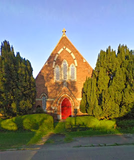
Photos of areas in the local area that are community areas

  church
 pond
 the village green pond
 red lion

Possible content for campaign